This week I feel as though I did a lot of refining of one of my concepts but think I should explore a different path. I did a lot with my “dying language” concept which consisted of skull and tiki subject matter. Seeing everyones posters on the wall today made me realise my concept wasn’t necessarily the one to stand out. I was quite disheartened by the amount of red, black and white. I tried using a different colour in my poster, green, the colour of pounamu, but it wasn’t as strong and wasn’t as quick to identify my topic as red white and black are the Māori colours.
I moved on to a more typographic approach and will be exploring ways I can integrate a clear rhetoric with type and image combination.
Heres what I’ve done so far
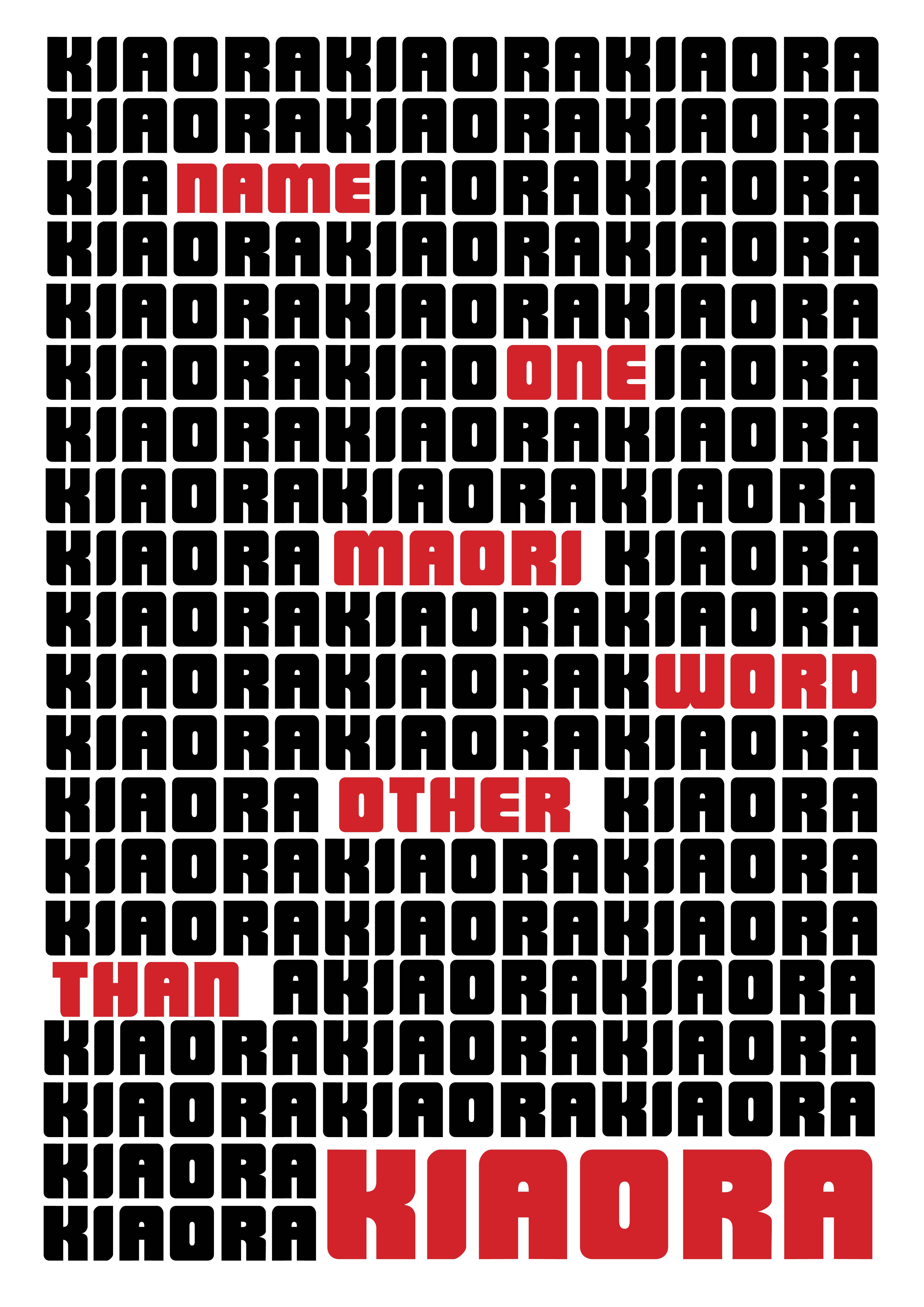
I like the repetition as is dramatises the fact that the most common Māori word known by non Māori speakers is kia ora – hello. It challenges the viewer to think if they do know any other Māori words and if not, might inspire them to learn
